When a 1 or 2 color job is printed the colours are created using a completely different system to full colour and therefore must be saved differently. With full colour printing all the colours are created by laying down 4 layers of tiny dots of Cyan, Magenta, Yellow and Black ( CMYK ) ink. These tiny dots when viewed by the human eye create the illusion of the full colour spectrum. However if you look at them through a magnifying glass you will see them as they really are.
With a 1 or 2 colour job though a tin of the exact colour ink you have specified is put on the printing press. It is very much like going to a DIY shop and selecting a tin of paint. The colour you select is in the tin, you do not have to mix it up yourself. It is because of this that you must save the colours differently from full colour artwork.
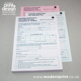
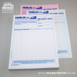
If you are saving your artwork as a PDF then save your colours in the exact Pantone colour you want and definitely not as a CMYK or RGB colour – Pantone is the industry standard colour referencing system. This way we will be able to separate the colours correctly to make the printing plates.
The one big exception to this is Photoshop because it should not be used for doing spot color artwork. If you have no other choice though there is a way to get around the problem. Save your spot colours as 100% pure process colours and we will apply the correct Pantone colour on the printing press. Eg, if you were designing a red and green job save everything you intend to be red as 100% process magenta and everything you intend to be green and 100% process blue. We will then do the rest for you.
Please feel free to call of more advice, it is an unusual concept to follow for those not in the industry.