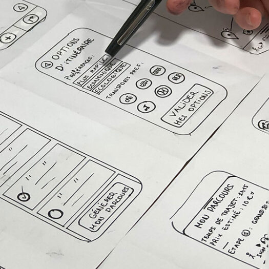
You may have heard the term “Responsive Web Design” when people talk about websites – but what exactly does it mean?
In the past, websites were built to a specific size which would fit nicely on to the standard computer monitors of the time. This was usually no bigger than 960 pixels in width. As a result people with lower resolution screens could still view the full website and see the content. However, because this size was fixed, it was not able to adapt as screens got smaller. On smaller screens, the website often becomes zoomed-out and the text shrinks down to the point it’s unreadable. You’ve probably seen this if you’ve ever visited an old, outdated website on a modern tablet or mobile device.
The rise of touchscreen devices.
In the current age of mobile devices and tablets, you can never be quite sure what size screen the user is visiting your website on. Due to this variety in screen sizes, the “Responsive Web Design” practice became popular. The main idea behind Responsive Web Design is that the website will detect the size of the screen and adapt. This is done by automatically reorganising itself to show the best viewing experience for the available screen size.
Website designers will often start with the mobile view of the website at first. This is because smaller screens have the most limited space to fit all important information onto. Once it has been laid out for mobile, the next step is to redesign it for the next size up – tablets. With the extra space you gained, more things can be added to the website design. This can take the form of additional images, buttons or other interactive elements. Things that would clutter up the screen, or be difficult to use on a smaller handheld device.
Finally the responsive web design is modified for the largest screen devices. Devices such as laptops, desktop computers with high definition monitors. This is often the most complex view where users will be generally interacting with a keyboard and mouse instead of a touch-screen. Features such as mega-menus and video-backgrounds are common at this size. However, they do not tend to be found as part of the small screen design because they will not fit
Call our Pembrokeshire website designers today to arrange a free, no commitment review of your websites responsiveness.
Does my website really need responsive web design?
If your website does not use responsive design, it is likely that your users are not getting a good experience on your website across all devices. “So what?” you might say, “My website still works fine on a computer!“. By not embracing device users you could be giving a bad experience to up to 55% of visitors to your website. Mobile devices are currently the go-to way to browse the internet, and show no sign of slowing down. So is you website design does not work well on a mobile device you are alienating half of your potential customers.
Modern Print & Design’s website designers in Pembrokeshire have years of experience with responsive web design. So if you need help making your website responsive, or would like us to review your website free of charge, call today on 01646 682676 . Alternatively get in touch filling out the handy form on our Contact Us page.